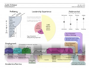
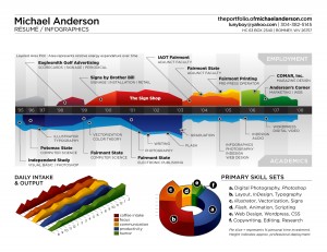
[NOTE: The original title of this post was “CV’s Worth Looking at”]
Many, if not most of you, know what it’s like to send your resume (CV) to hundreds of international HR departments in hopes that someone will actually get to yours and take the time to look at it. After all, you spent quite a bit of hours fixing and spicing it up with those little harmless white lies here and there ;)! Of course I graduated with high honors, speak Dutch and Swahili, play the tuba and violin and excel in powerpoint! But please don’t ask me to put my money where my mouth is words are!
In general, resume’s pretty much look the same – minus the information. There’s a few professional formats for you to choose from and that’s about it. Well, here’s a new way to designing your resume; a way that will surely get you some extra attention – and maybe even put you at the top of the ‘I need a job’ pile. Below are 2 examples of infographic resume’s. They’re definitely the most original I’ve seen. Heck, I’d hire ’em!
What do you think? Would you have yours done that way? Post your comments.
click on the image to enlarge.

[image credit (left): coolinfographics.com]
[image credit (right): doobiebrain.com]


