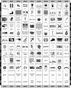
as you can see, i have come to favor these rather entertaining infographics. i find that they get the message across in an efficient and forceful manner – one that is also visually appealing to the reader. in general, i try to post things that i would want to see or know about – things that are easy to read and understand – for the most part. and as we know, pictures are worth a thousand words. on that note, here’s a chart by phillip neimeyer from the nytimes website, entitled ‘picturing the past 10 years’. phillip does a brilliant job picturing the last decade using icons and original pictures – a different one for each of the 12 categories.
click on image to enlarge.
*phillip niemeyer is an art director at double triple, an art and design studio in new york.


